Trustpilot reviews, wherever you browse
The short version
Trustpilot tends to show up at the very end of a shopping journey, as the “is this company legit?” check just before someone hits buy. We wanted to be part of the journey much earlier. As lead designer, I took this 0-to-1 Chrome extension from first research session to launch, putting Trustpilot ratings one click away on any site. It passed 30,000 users in its first month, with only a slight dip in retention since.
The problem
Trustpilot already hosts one of the largest review databases around — 300 million+ reviews across 529,000+ registered businesses, as of 2024 — but almost none of that shows up until a shopper actively goes looking for it.
Shoppers don’t visit one site and call it a day. They compare products, hop between stores and open a lot of tabs. Every time they wondered “can I trust this company?”, they had to leave the page, search Trustpilot, read the reviews and go back. People put up with it, but it was tedious and slow.
We framed it as one question: how might we engage consumers at the early stages of their buying journey, to effortlessly guide them toward making informed, trust-based decisions?
Discovery: what shoppers told us
I led a research study with 12 Trustpilot users — six frequent, six infrequent — over a week of interviews and synthesis, to test our assumptions and find out what would actually help people decide. Three themes stood out:
- Reducing friction: people wanted to verify a site’s trustworthiness through easily accessible ratings, without searching external sources for credibility.
- Trust signals: people wanted instant alerts when visiting untrustworthy websites, to help them avoid risky purchases and misinformation.
- Building confidence: people wanted quick access to customer feedback and reviews, to assess a company’s trustworthiness before they bought.
The takeaway was to keep it simple and transparent. We distilled it into one problem statement: in a busy online marketplace, consumers often struggle to quickly and confidently verify a company’s credibility, leading to frustration and delays — even when they’re willing to tolerate some friction.
Getting everyone on the same page
I ran working sessions with senior leadership, product, engineering and marketing to agree on the problem, the technical constraints, rough timescales for an MVP, and the KPIs that would tell us if it was working. We also aligned on what the extension should do for the business:
- Boost consumer engagement through quick validation and easy review submission
- Strengthen the brand by making Trustpilot visible earlier in the buying journey
- Generate data insights that could feed back into the platform and benefit businesses
From there we settled on four design principles:
- Insightful: glanceable information that helps people decide fast
- Reliable: trust signals people can actually depend on
- Respectful: present when useful, never intrusive
- Seamless: moving between the extension and Trustpilot should feel like one experience
Design
I explored several directions before testing: a conversational concept that played “the voice of trust,” guiding people with prompts as they shopped; a bolder, more emotive treatment for highlighting ratings; and a Google Search integration that surfaced Trustpilot ratings right in the search results, before someone even landed on a site. Testing showed a clear preference for keeping things simple — the bolder concepts felt intrusive or ad-like, while a plain, extension-sized Trustpilot experience felt safe and familiar. So the baseline direction won, with the Google Search integration carried forward into the MVP.
 Coming soon
The core pieces that made it through:
- A toolbar icon that changes colour to reflect a site’s rating at a glance
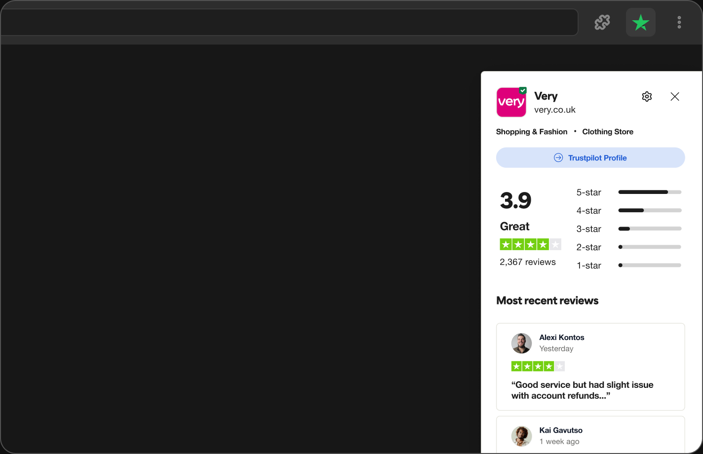
- An instant overlay showing the Trustpilot rating for the current site
- A warning flag for businesses reported for scam-like behaviour toward customers
- A prompt to leave the first review when a business has no Trustpilot profile yet
- A seamless link through to the full Trustpilot profile
Coming soon
And for businesses that had been misbehaving, a clear warning in place of the usual rating:
Coming soon
I then built high-fidelity prototypes in Figma, working with the design systems team on components, a UX writer on the wording, and engineers to check feasibility. I also built the UI as a modular framework of components, feature by feature, so we could ship a gradual, phased release rather than one big-bang launch. Three things guided every decision:
- Minimal clicks: If it took more than a click or two, it was too much.
- Smooth handoff: Moving between the extension and Trustpilot should feel like one experience.
- Visual clarity: Trustpilot’s branding is present, but never shouting over the site you’re on.
Testing and iteration
I ran usability tests with participants from Trustpilot’s core audience, asking them to check a site’s reviews and leave a review through the extension. Three things came back clearly: the first version risked overwhelming people by trying to do too much at once, the design systems team wanted a simpler colour palette and more consistent widget shapes, and reviewers wanted less scrolling, not more. Underneath all of it was one clear signal — intrusiveness. People worried the experience would get in their way on sites they were trying to use. I addressed it three ways:
- A repositionable widget: people could drag the on-site prompt anywhere on the browser sidebar, instead of it dictating its own position.
- A preferences toggle: explicit control over what showed and when, including a list of sites where they’d rather not see it at all, without losing one-click access to Trustpilot content.
- A passive toolbar icon: instead of a persistent on-page prompt, the toolbar icon itself changed colour to reflect a site’s rating — present, but never in the way.
Alongside that: privacy worries meant we added clear messaging about data and permissions, and speed complaints led to performance improvements on the engineering side.
Coming soon
The preferences toggle and hide list, in the extension’s own settings:
Coming soon
Throughout, I stayed in close contact with our Tech Lead and engineers through regular check-ins, so what shipped matched what we designed.
Launch
Before launch, I ran a technical hand-off with our Tech Lead and engineers to size and sequence each feature, and worked with product marketing and community management to line up an in-app notification, an email campaign and a limited-time promotion for early downloads — plus a plan to pre-empt negative feedback and trolls in the community. Legal and compliance signed off along the way, and I partnered with our PM to run an internal BETA group to catch bugs and experience issues before the wider release.
After launch, I teamed up with analytics to track downloads, activation, engagement and feedback from reviews and support channels, which gave us a steady list of improvements to pursue.
Results
30,000+
users in the first month, with only a slight dip in retention since
15%
feedback response rate from users, shaping a steady stream of improvements
A strong run of 4+ star Chrome Web Store reviews, even as a handful of bots and trolls dragged down the overall rating
The extension strengthened Trustpilot’s presence earlier in the shopping journey, which was the whole point — and the internal enthusiasm it generated, including from our CEO, helped build momentum for the next phase of the product.
What I took away
The best version of this product came from balancing what users wanted with what was technically possible, and from involving stakeholders and engineers early. Testing early and often shaped it too — especially learning when to push for something bolder, and when to stay grounded in what people already trusted. Managing expectations, both our own and the business’s, made all the difference in shipping something people actually used.